One of the problems that the founders of Saturday identified during their research was that a new user would be onboarded into a chat and not realize the magic that lied behind the "back" button in the top left. They thought the chat was all there was.
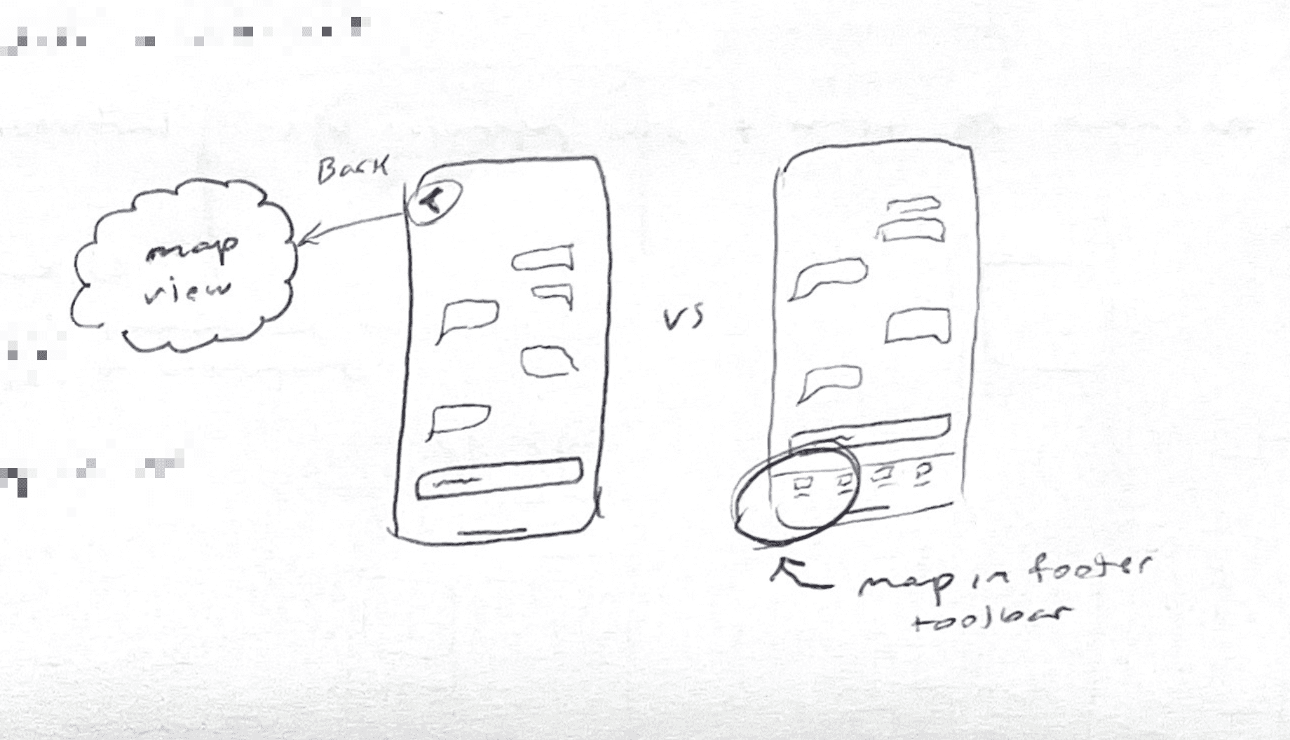
My proposal was to borrow a move out of Twitter's playbook, which is to keep the toolbar at the bottom visible at all times. In this sketch on the left you can see that in order to discover the map view (in the cloud) you have to click the back button, but if we showed a persistent footer you'd be able to immediately recognize that there's a map tab.
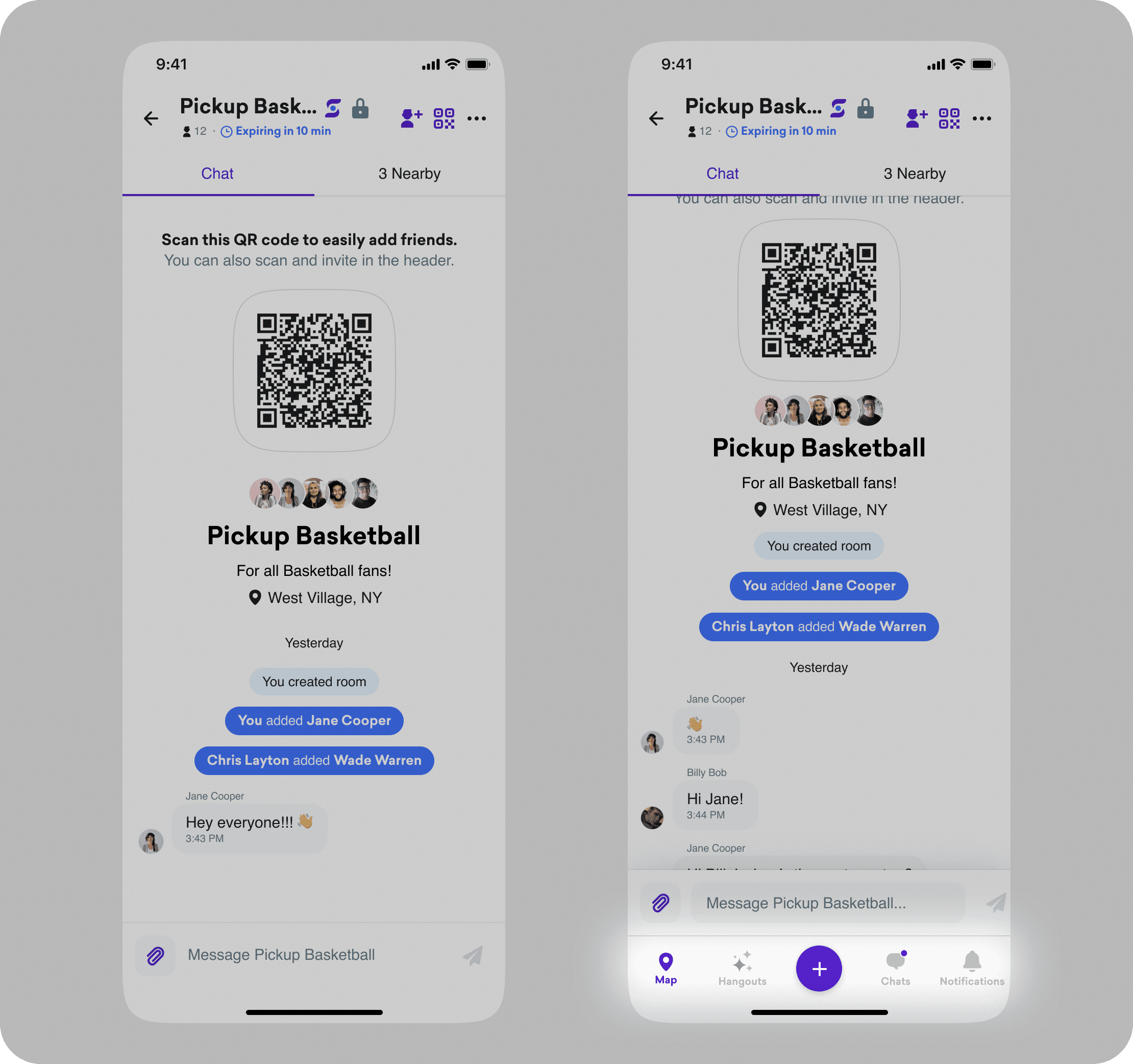
This proposal turned out to be too big of an engineering lift for the deadline we were looking at (we were trying to ship a solution before SXSW 2023) so the decision was made to default the user to the map view, and nudge them into the chat they were initially invited to using a notification badge on the tab.
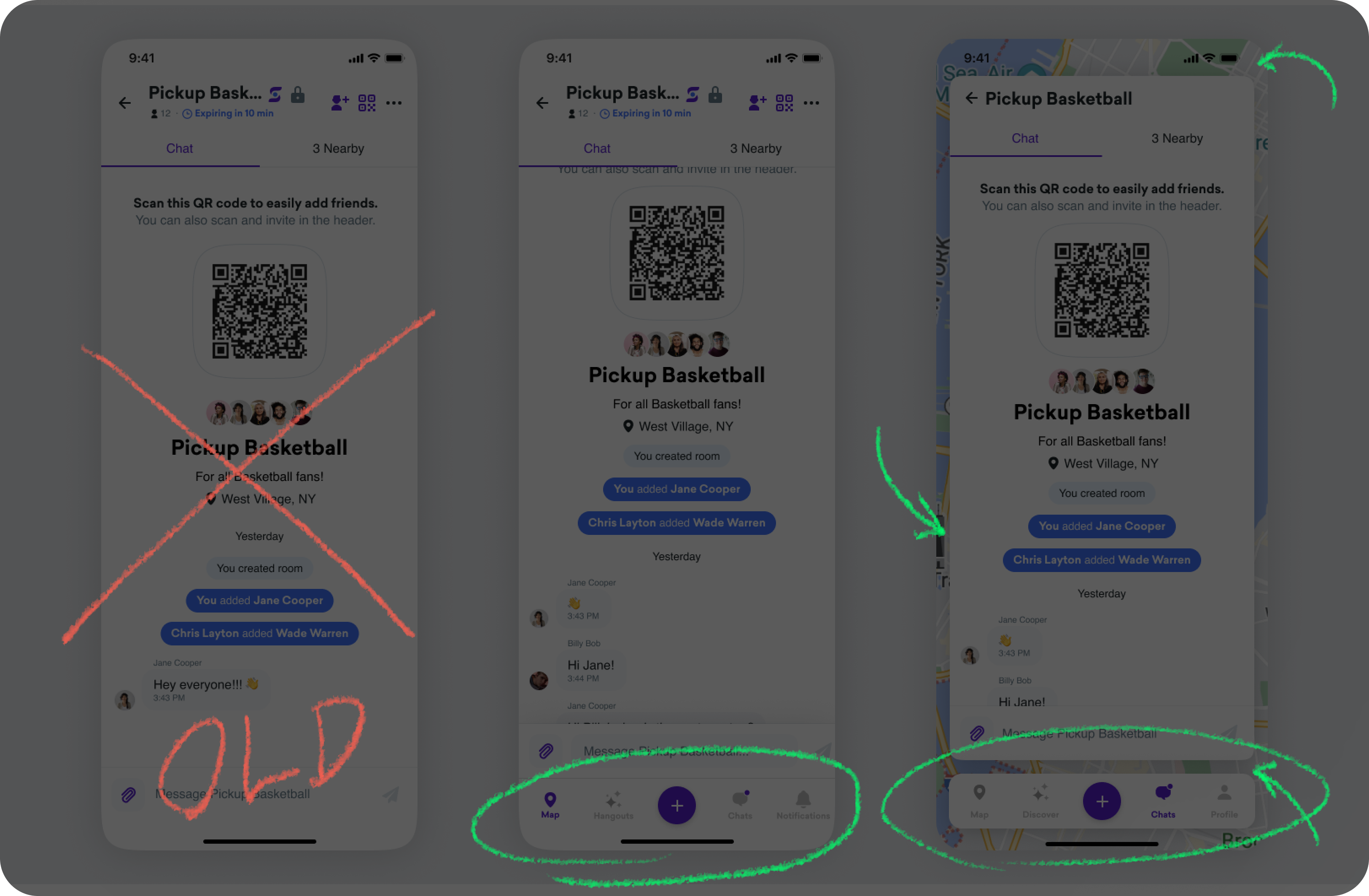
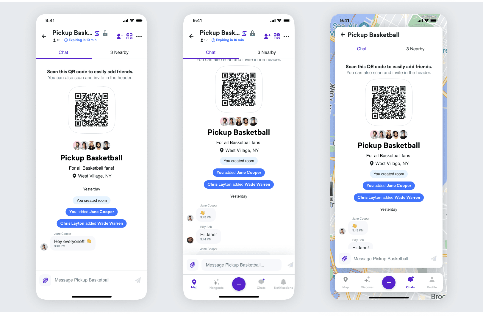
An even heftier engineering ask that I sketched out and prototyped was the idea that the map could be escalated to be the core experience of the app by making it a wrap-around background and overlaying all UI as floating elements atop the map.
Comparisons…
…between the old design, the proposed persistent tab bar, and the proposed map-overlay.
Switching tabs
Switching between tabs will behave normally in this new map-overlay view, but clicking the map will hide the overlay views entirely and let the user be immersed in the map.
Comparison
Here's a video comparing the current full-page view and the proposed map-overlay view. The latter obviously makes it very clear to the user that all of this information lives somewhere on the map.
One of the problems that the founders of Saturday identified during their research was that a new user would be onboarded into a chat and not realize the magic that lied behind the "back" button in the top left. They thought the chat was all there was.
My proposal was to borrow a move out of Twitter's playbook, which is to keep the toolbar at the bottom visible at all times. In this sketch on the left you can see that in order to discover the map view (in the cloud) you have to click the back button, but if we showed a persistent footer you'd be able to immediately recognize that there's a map tab.


This proposal turned out to be too big of an engineering lift for the deadline we were looking at (we were trying to ship a solution before SXSW 2023) so the decision was made to default the user to the map view, and nudge them into the chat they were initially invited to using a notification badge on the tab.
An even heftier engineering ask that I sketched out and prototyped was the idea that the map could be escalated to be the core experience of the app by making it a wrap-around background and overlaying all UI as floating elements atop the map.
Comparisons…
…between the old design, the proposed persistent tab bar, and the proposed map-overlay.


Switching tabs
Switching between tabs will behave normally in this new map-overlay view, but clicking the map will hide the overlay views entirely and let the user be immersed in the map.
Comparison
Here's a video comparing the current full-page view and the proposed map-overlay view. The latter obviously makes it very clear to the user that all of this information lives somewhere on the map.
One of the problems that the founders of Saturday identified during their research was that a new user would be onboarded into a chat and not realize the magic that lied behind the "back" button in the top left. They thought the chat was all there was.
My proposal was to borrow a move out of Twitter's playbook, which is to keep the toolbar at the bottom visible at all times. In this sketch on the left you can see that in order to discover the map view (in the cloud) you have to click the back button, but if we showed a persistent footer you'd be able to immediately recognize that there's a map tab.


This proposal turned out to be too big of an engineering lift for the deadline we were looking at (we were trying to ship a solution before SXSW 2023) so the decision was made to default the user to the map view, and nudge them into the chat they were initially invited to using a notification badge on the tab.
An even heftier engineering ask that I sketched out and prototyped was the idea that the map could be escalated to be the core experience of the app by making it a wrap-around background and overlaying all UI as floating elements atop the map.
Comparisons…
…between the old design, the proposed persistent tab bar, and the proposed map-overlay.


Switching tabs
Switching between tabs will behave normally in this new map-overlay view, but clicking the map will hide the overlay views entirely and let the user be immersed in the map.
Comparison
Here's a video comparing the current full-page view and the proposed map-overlay view. The latter obviously makes it very clear to the user that all of this information lives somewhere on the map.
More articles about
Saturday
More articles in
Work Experience


