In NYC I ran into some founders of a stealth chat app whose mission was to combine all chat interfaces into one single interface.
We hit it off and I was brought on for a very short design experimentation to help uncover potential directions that their app could take in the long term. Their early prototype was already built, but for the sake of generating fresh new ideas, they talked me through the problem space and sent me on an open-ended journey.
Given how deeply I've thought about the mechanics of chat interfaces (which I hope one day publish) I thought this was an interesting problem space worth my time.
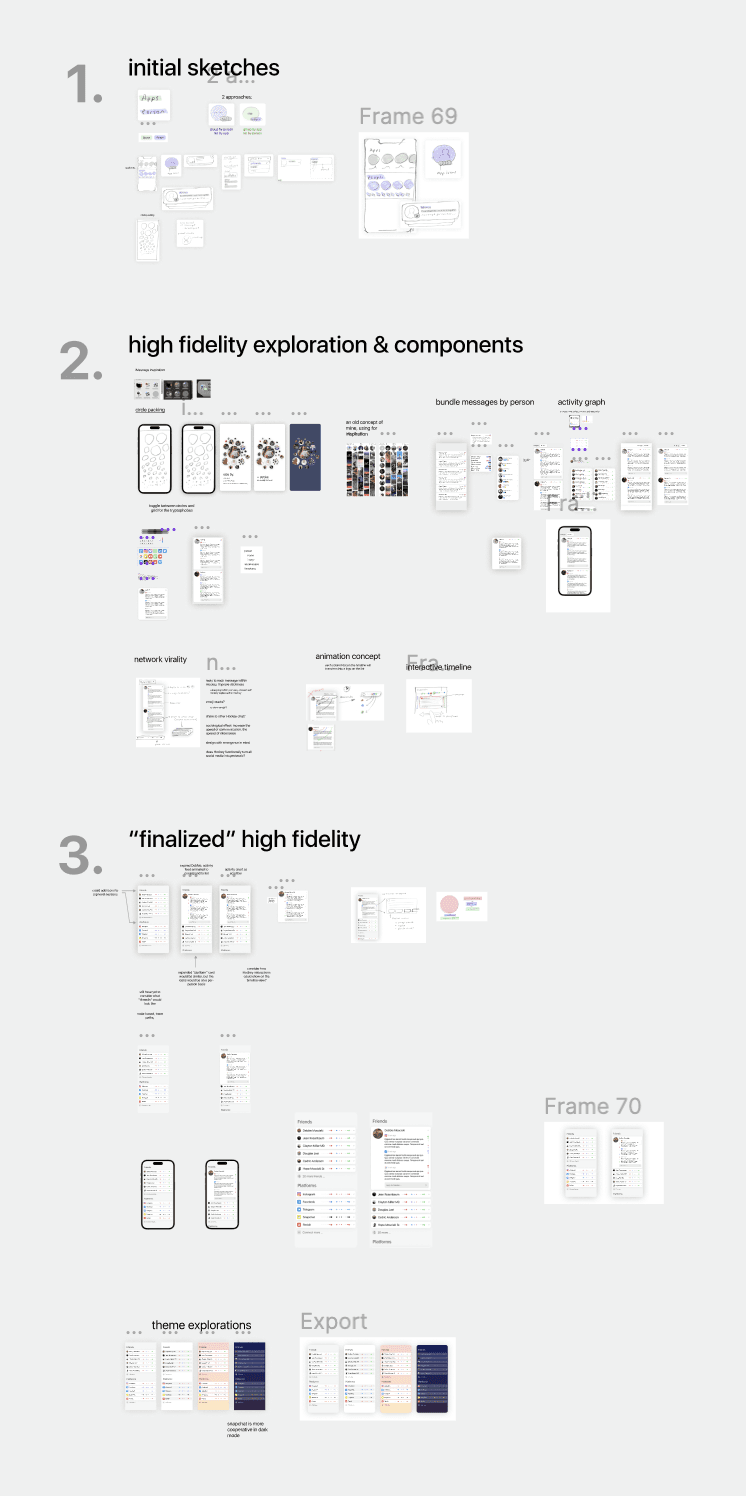
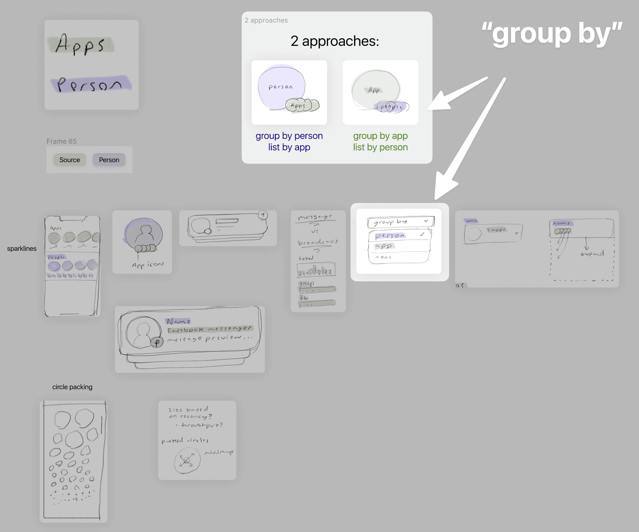
The initial sketches explored the basic primitive data objects for the combined chat app, which was basically: "people" (who is this notification from, shown in purple) and "applications" (where did this notification originate, shown in green)

What's funny is that through this exploration I eventually came to the realization that this is the same problem space given to the Notifications teams for operating systems such as iOS, Android, macOS, Windows, etc.
One unique (I think!) insight I came to that Notifications teams seldom seem to implement (if ever!) is this ability to change which object your notifications are grouped by: for example, "Group by person" instead of "Group by notification"
This probably has to do with the fact that identity isn't shared across devices. Perhaps it should be.
High fidelity exploration & components
After the sketches, I began collecting some inspiration from screenshots and old designs of mine and began building out some basic components that could be used.
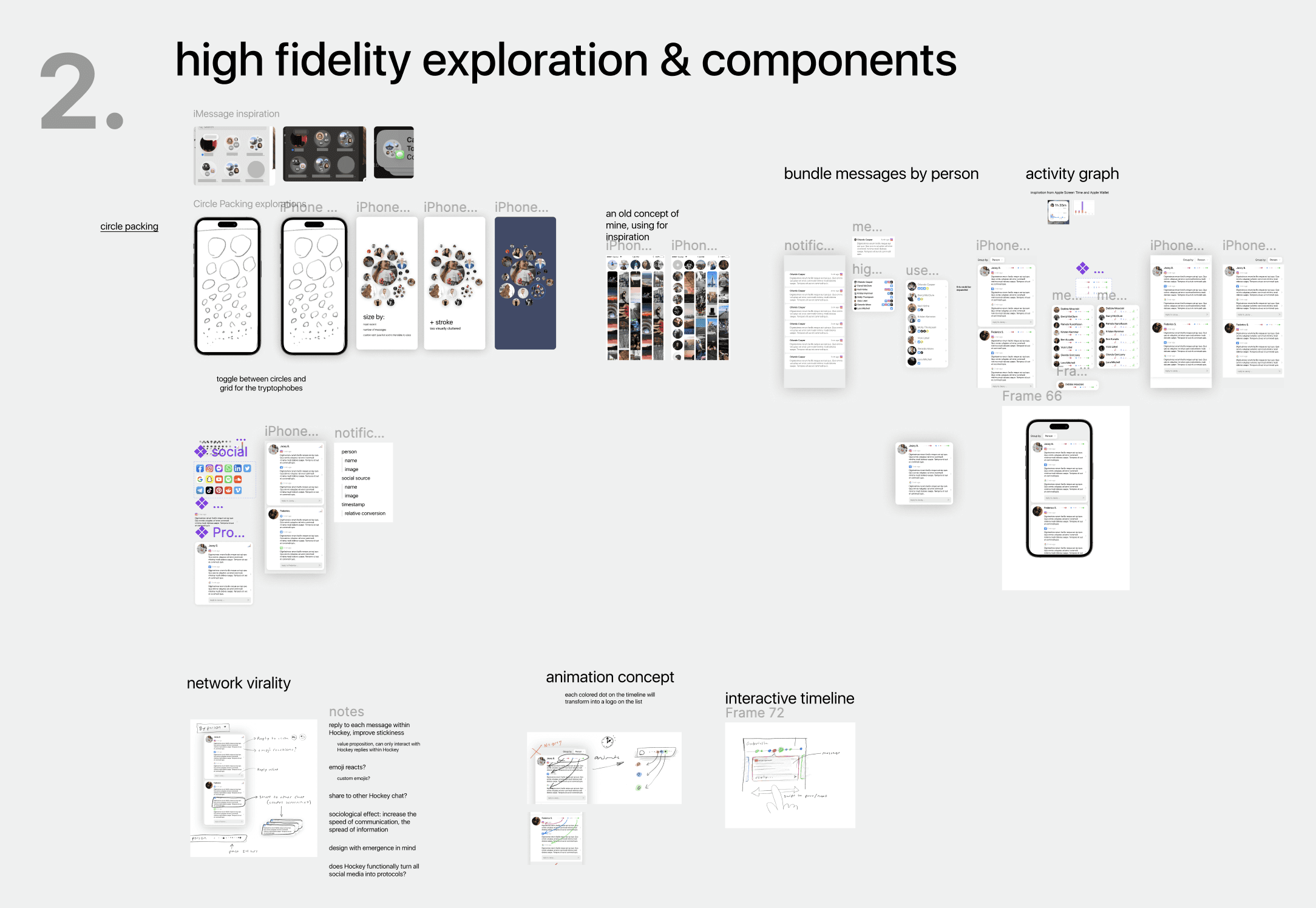
I was inspired by some of the designs used by Apple in iMessage where social groups were visualized as packed circles.
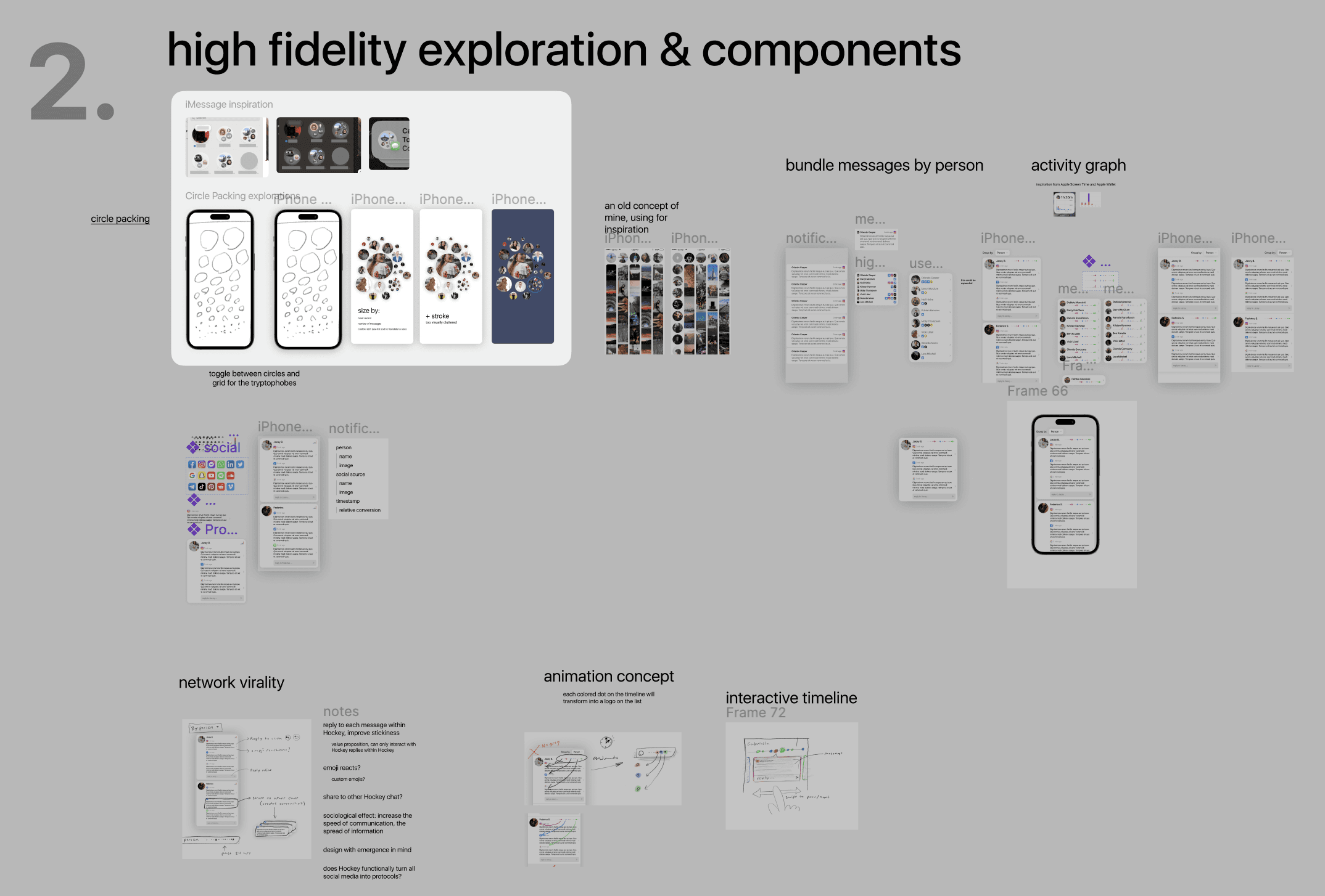
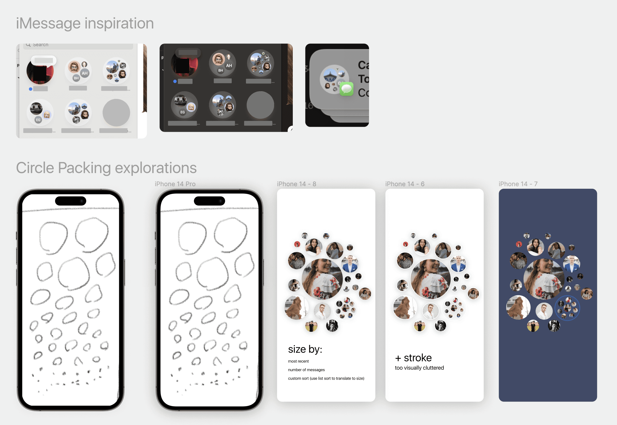
While I didn't use those designs moving forward, it was a fun exploration and perhaps it'll contribute to something else I design further down the road. I instead moved towards a card-based visualization which utilized activity graphs.
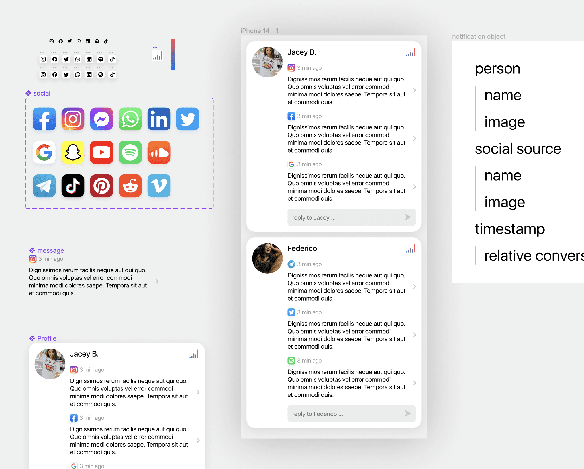
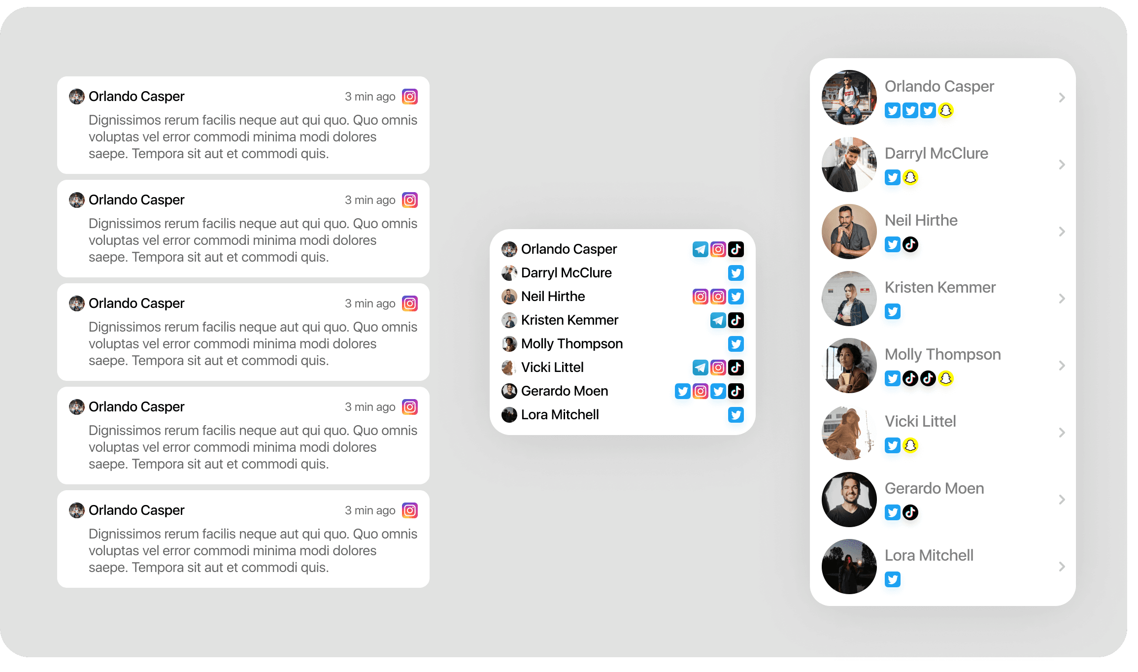
In addition to the Person-App data object, I also wanted to visualize the temporal data to let users quickly see how active an object is over time. I designed a few different versions of the Activity chart (component shown above) so I could swap it out in the various lists I'd configured in my little design system.

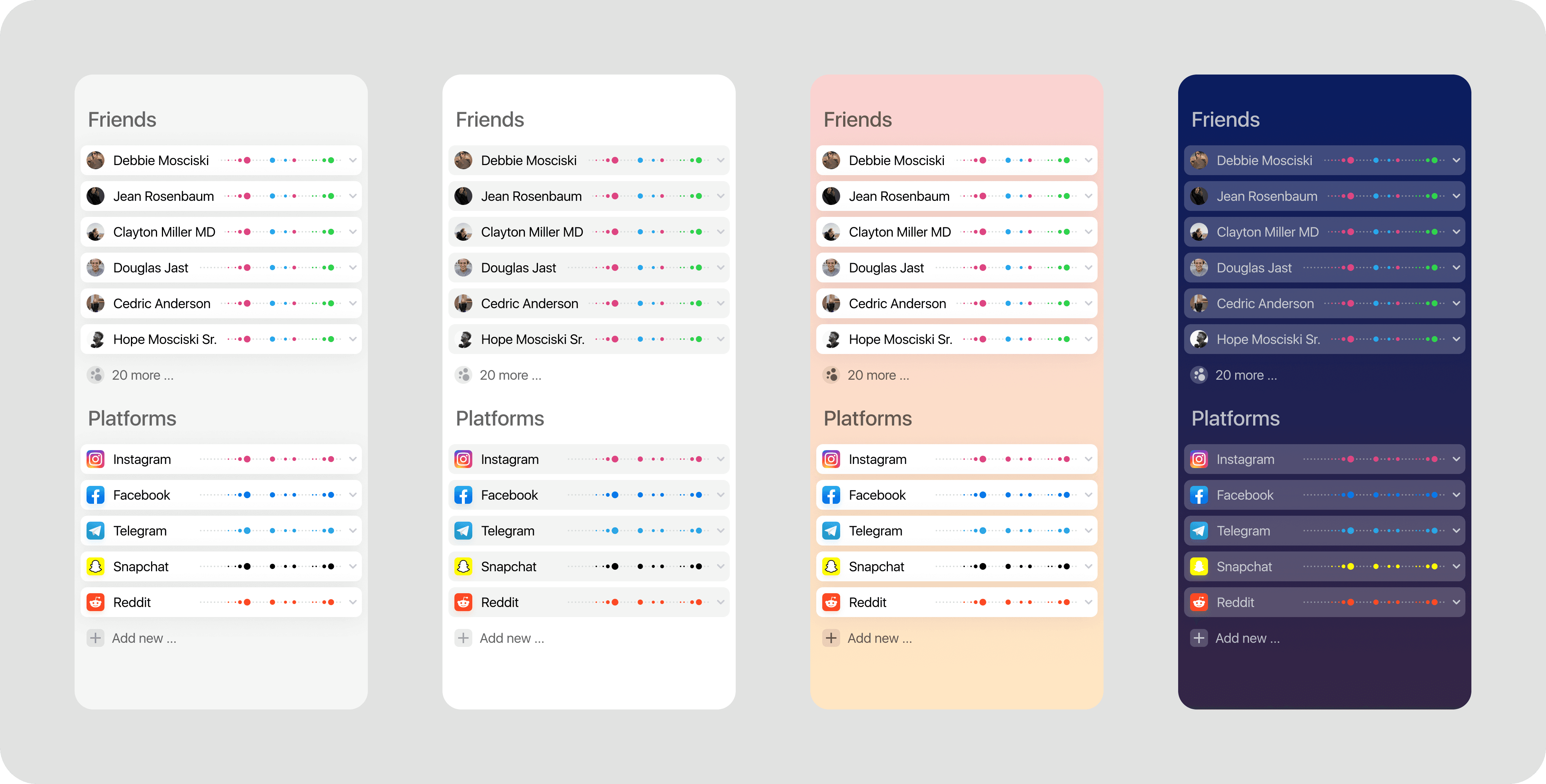
Here's the design I arrived at where each grouped object has the activity graph to make it evident how active the person or platform is, but then expands to show details of each event or activity.

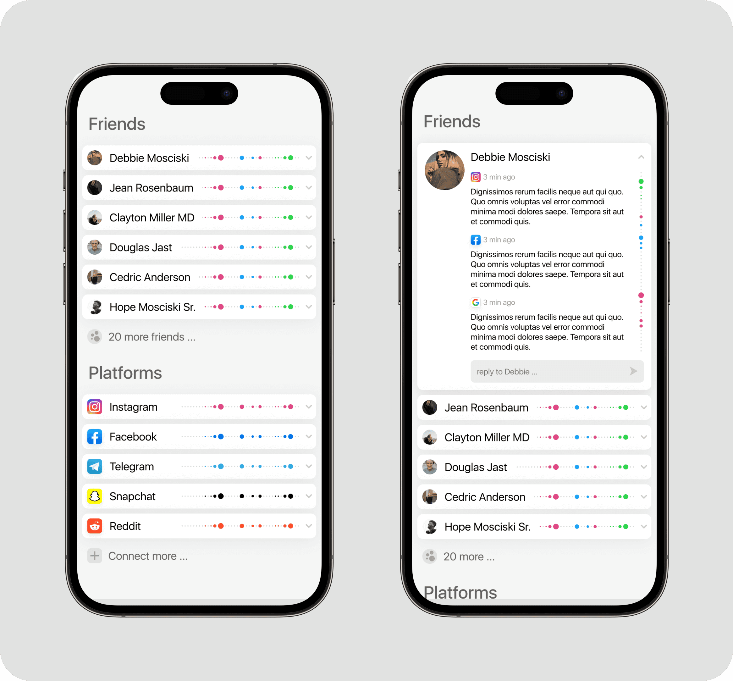
With these designs there's also the idea that these "activity dots" could animate their position when changing from the Collapsed variant to the Expanded variant. With this updated design, the vertical activity dots wouldn't be necessary, since the horizontal dots would animate directly into their corresponding social icons.

And the icing on the cake is of course that I whipped up some themes, some of which are practical (like dark mode) and others are purely aesthetic (the colored theme, and the inversion of the light theme between white-on-grey and grey-on-white)
All in a day's work!
The founders loved what I came up with, we'll see if anything comes of it. If not, these explorations will certainly help to influence my future designs, I'm already considering deploying similar patterns in WeWrite.
Hope you enjoyed this little design exploration.
In NYC I ran into some founders of a stealth chat app whose mission was to combine all chat interfaces into one single interface.
We hit it off and I was brought on for a very short design experimentation to help uncover potential directions that their app could take in the long term. Their early prototype was already built, but for the sake of generating fresh new ideas, they talked me through the problem space and sent me on an open-ended journey.
Given how deeply I've thought about the mechanics of chat interfaces (which I hope one day publish) I thought this was an interesting problem space worth my time.

The initial sketches explored the basic primitive data objects for the combined chat app, which was basically: "people" (who is this notification from, shown in purple) and "applications" (where did this notification originate, shown in green)

What's funny is that through this exploration I eventually came to the realization that this is the same problem space given to the Notifications teams for operating systems such as iOS, Android, macOS, Windows, etc.
One unique (I think!) insight I came to that Notifications teams seldom seem to implement (if ever!) is this ability to change which object your notifications are grouped by: for example, "Group by person" instead of "Group by notification"
This probably has to do with the fact that identity isn't shared across devices. Perhaps it should be.

High fidelity exploration & components
After the sketches, I began collecting some inspiration from screenshots and old designs of mine and began building out some basic components that could be used.

I was inspired by some of the designs used by Apple in iMessage where social groups were visualized as packed circles.


While I didn't use those designs moving forward, it was a fun exploration and perhaps it'll contribute to something else I design further down the road. I instead moved towards a card-based visualization which utilized activity graphs.


In addition to the Person-App data object, I also wanted to visualize the temporal data to let users quickly see how active an object is over time. I designed a few different versions of the Activity chart (component shown above) so I could swap it out in the various lists I'd configured in my little design system.

Here's the design I arrived at where each grouped object has the activity graph to make it evident how active the person or platform is, but then expands to show details of each event or activity.


With these designs there's also the idea that these "activity dots" could animate their position when changing from the Collapsed variant to the Expanded variant. With this updated design, the vertical activity dots wouldn't be necessary, since the horizontal dots would animate directly into their corresponding social icons.

And the icing on the cake is of course that I whipped up some themes, some of which are practical (like dark mode) and others are purely aesthetic (the colored theme, and the inversion of the light theme between white-on-grey and grey-on-white)

All in a day's work!
The founders loved what I came up with, we'll see if anything comes of it. If not, these explorations will certainly help to influence my future designs, I'm already considering deploying similar patterns in WeWrite.
Hope you enjoyed this little design exploration.
In NYC I ran into some founders of a stealth chat app whose mission was to combine all chat interfaces into one single interface.
We hit it off and I was brought on for a very short design experimentation to help uncover potential directions that their app could take in the long term. Their early prototype was already built, but for the sake of generating fresh new ideas, they talked me through the problem space and sent me on an open-ended journey.
Given how deeply I've thought about the mechanics of chat interfaces (which I hope one day publish) I thought this was an interesting problem space worth my time.

The initial sketches explored the basic primitive data objects for the combined chat app, which was basically: "people" (who is this notification from, shown in purple) and "applications" (where did this notification originate, shown in green)

What's funny is that through this exploration I eventually came to the realization that this is the same problem space given to the Notifications teams for operating systems such as iOS, Android, macOS, Windows, etc.
One unique (I think!) insight I came to that Notifications teams seldom seem to implement (if ever!) is this ability to change which object your notifications are grouped by: for example, "Group by person" instead of "Group by notification"
This probably has to do with the fact that identity isn't shared across devices. Perhaps it should be.

High fidelity exploration & components
After the sketches, I began collecting some inspiration from screenshots and old designs of mine and began building out some basic components that could be used.

I was inspired by some of the designs used by Apple in iMessage where social groups were visualized as packed circles.


While I didn't use those designs moving forward, it was a fun exploration and perhaps it'll contribute to something else I design further down the road. I instead moved towards a card-based visualization which utilized activity graphs.


In addition to the Person-App data object, I also wanted to visualize the temporal data to let users quickly see how active an object is over time. I designed a few different versions of the Activity chart (component shown above) so I could swap it out in the various lists I'd configured in my little design system.

Here's the design I arrived at where each grouped object has the activity graph to make it evident how active the person or platform is, but then expands to show details of each event or activity.


With these designs there's also the idea that these "activity dots" could animate their position when changing from the Collapsed variant to the Expanded variant. With this updated design, the vertical activity dots wouldn't be necessary, since the horizontal dots would animate directly into their corresponding social icons.

And the icing on the cake is of course that I whipped up some themes, some of which are practical (like dark mode) and others are purely aesthetic (the colored theme, and the inversion of the light theme between white-on-grey and grey-on-white)

All in a day's work!
The founders loved what I came up with, we'll see if anything comes of it. If not, these explorations will certainly help to influence my future designs, I'm already considering deploying similar patterns in WeWrite.
Hope you enjoyed this little design exploration.
More articles about
Stealth Startup


